Warwick students angry at 'aubergine' university logo
A petition urging the university to halt its £80,000 rebrand has received over 3,800 signatures
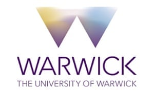
 The University of Warwick’s new logo, against which more than 3,800 students have signed a petition. Photograph: University of Warwick
Natalie Gil
Over 3,800 students at the University of Warwick have signed a petition calling on the university to halt its rebrand, after its new logo was revealed on Tuesday.
Students are concerned that it “does not reflect the identity of such a high-class academic institution”.
The bold new logo features “Warwick” in capital letters and a document released by the university to students cites its main colour as being “Warwick aubergine”.
The petition, set up by Hiran Adhia, 20, a politics, philosophy and economics student at Warwick, urges the university to “halt the re-branding process now and consult students before any more money is spent”, and mentions a “lack of communication and the general disconnection that the university currently has with its students.”
Peter Dunn, director of press and policy at Warwick, says 160 students, staff and alumni were consulted. “Students were the very first people asked to take part in groups to help create the new branding,” he says, and adds that there have been more students than staff involved in the design process.
The new logo was shown to students at the student union’s societies convention by the university’s head of marketing, where it emerged that the rebrand has cost the university £80,000 so far. The logo itself cost £16,000 plus VAT, according to Dunn.
Eliza Harris, 20, an English literature student at Warwick, says: “The new logo looks unprofessional and detracts from the integrity of Warwick and the success it has seen this year.
“I’m so proud of going to Warwick, but it’s not the logo of a top Russell Group University.”
For some, the student uproar is a sign of deepening tensions between Warwick students and staff. Harris says: “This past year has been tense, with the ongoing building works, and a lack of communication between the university body and the students really getting in the way of the student experience.
“This debacle over the logo has definitely made relations tense with administrative staff.”
But some think the controversy over the new logo is overblown. Hugh Osborn, 24, a PhD student in astronomy at Warwick, says: “I actually quite like the new logo. Warwick is one of the youngest top universities in the country and I think a modern, edgy logo like this is a good fit.
“There are many more important changes happening at Warwick – such as creeping commercialisation of education, the vice-chancellor’s ridiculous pay cheque and clamp-downs on student protest – that are far more deserving of student outrage than whether the new logo is too rectangular.
“The lack of proper consultation is symptomatic of how our university seems to care less about its students and more about its commercial backers.”
Shehab Khan, 21, who studies politics, philosophy and economics at Warwick, says: “Tensions between staff and students are the worst they’ve been in a very long time and this isn’t likely to help.”
Last month, the university’s vice-chancellor Nigel Thrift was recorded calling student protestors “yobs”.
Thrift has been the subject of numerous student protests on campus and the student union has passed a motion of no-confidence in him.
The reasons given included the university’s disputes with staff over wages, the vice-chancellor’s pay, and the university’s alleged failure to justify police brutality at last December’s tuitions fee protest, where a Taser was drawn and pepper spray allegedly used against students.
Keep up with the latest on Guardian Students: follow us on Twitter at@GdnStudents – and become a member to receive exclusive benefits and our weekly newsletter.
沒有留言:
張貼留言